25 High Contrast Font Styles for Premium Graphic Designs
In typography, a high contrast font refers to a typeface that possesses a dramatic difference between its thickest and thinnest strokes. This shows the structural “stress” and elegance of the letterform, which is often associated with the Didone or Modern Serif classifications for timeless luxury.
Beyond mere legibility, high-contrast fonts are chosen for their ability to command attention and convey a sense of prestige. This is why legendary brands like Vogue, Harper’s Bazaar, and Dior consistently use this style to maintain their exclusive brand image.
Key Takeaways
- High contrast fonts feature a dramatic difference between thick and thin strokes, creating an instant “premium” look.
- These typefaces are most effective for logos, headlines, and editorial titles where a sense of prestige is required.
25 High Contrast Font Choices for Premium Designs
High-contrast serif font or typography is instinctively perceived as more ‘expensive’ and ‘elegant’. This is why the majority of legacy luxury brands favor sharp serifs over simpler forms to maintain an aura of exclusivity. So, if you want to achieve that same level of them, explore our recommendations below!
1. Agraham
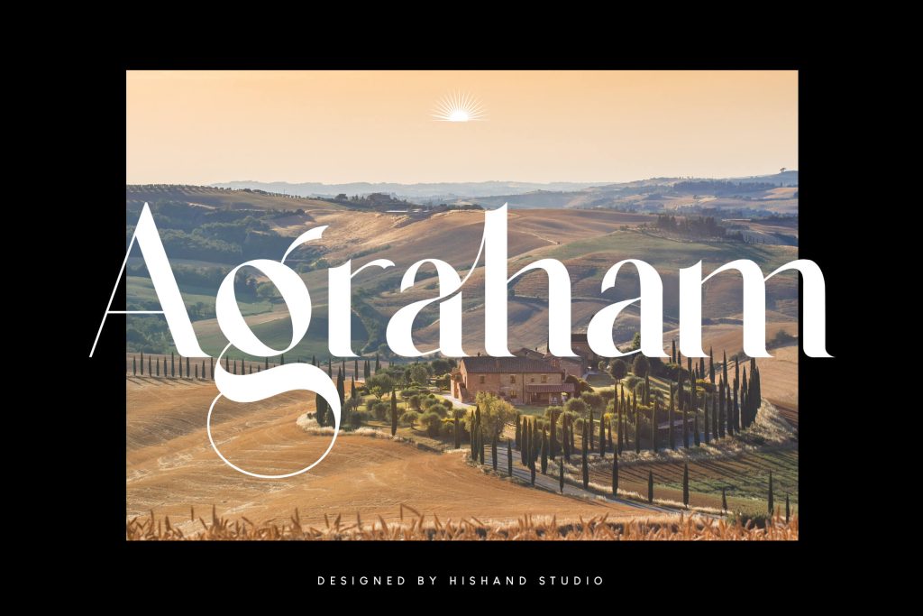
Sharp contrast and slim serifs define this typeface’s luxurious appeal. Premium branding projects benefit from its instant high-end feel.
2. Qe Laurenty
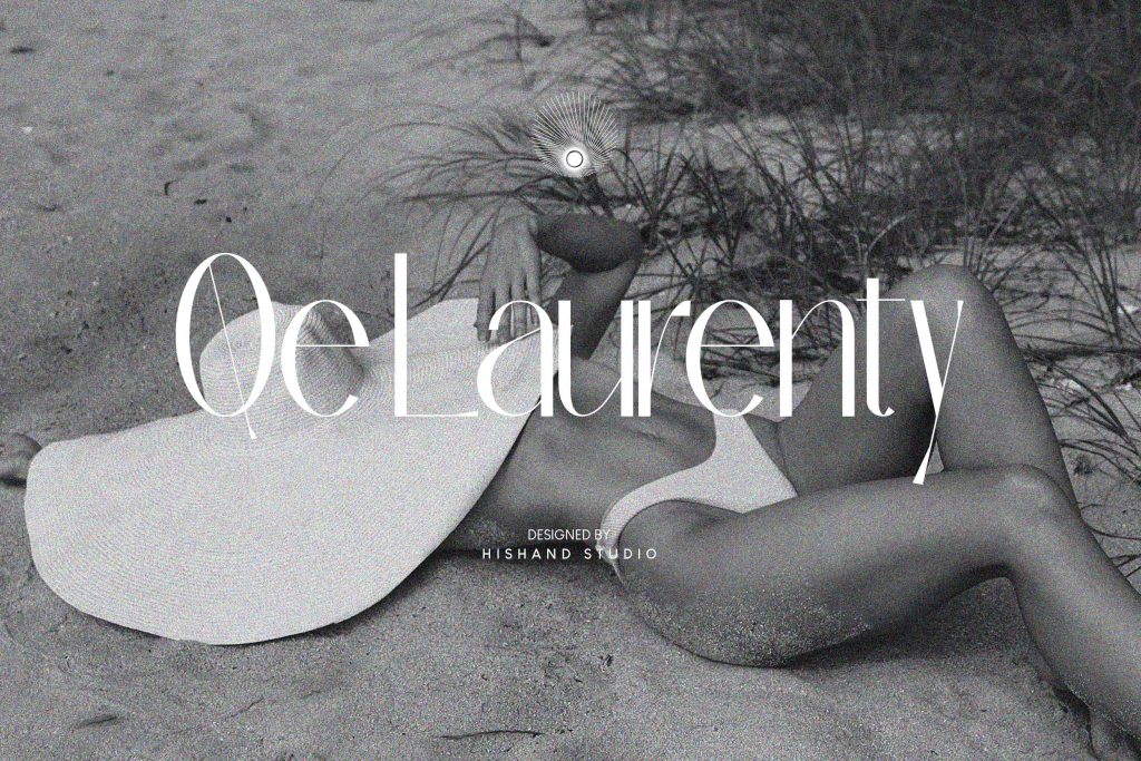
Clean, modern aesthetics emerge from this font’s balanced stroke weights. It is a top-tier choice for minimalist websites and digital layouts.
Also Read: 24 Enchanting Girly Fonts for Building Your Beauty Empire
3. Qrada
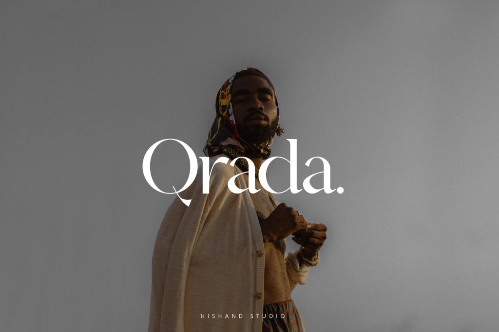
This font blends modern details with dramatic transitions to create a sophisticated tone. Editorial designs gain a refined yet approachable look here.
4. Saveya
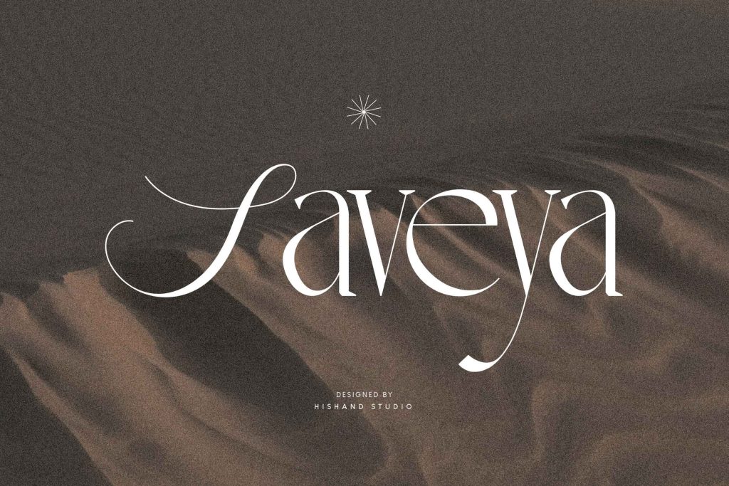
Expressive character radiates through this unique script-serif hybrid. Its fluid contrast adds a personal, artistic touch to logos and invitations.
5. Qarkine
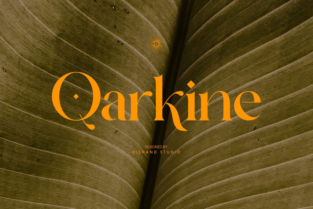
Sophistication is projected through every high-contrast stroke. As a centerpiece for luxury identities, it commands absolute professional respect.
6. La Qatrie
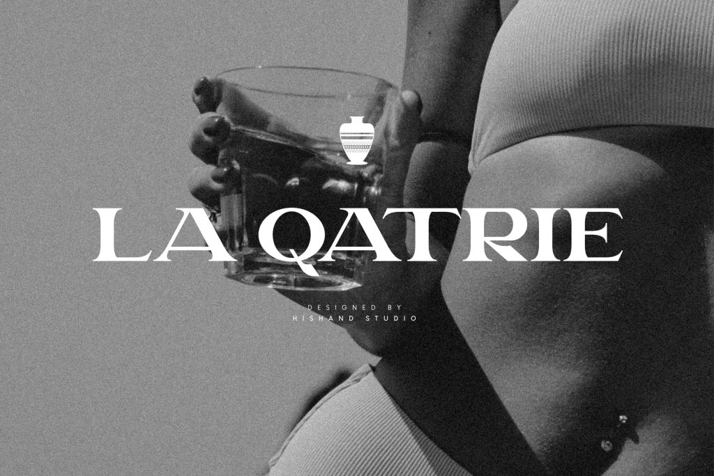
Creative headlines and posters find their voice in this bold display font. Its heavy weight differences ensure your message never goes unnoticed.
7. Oleragie
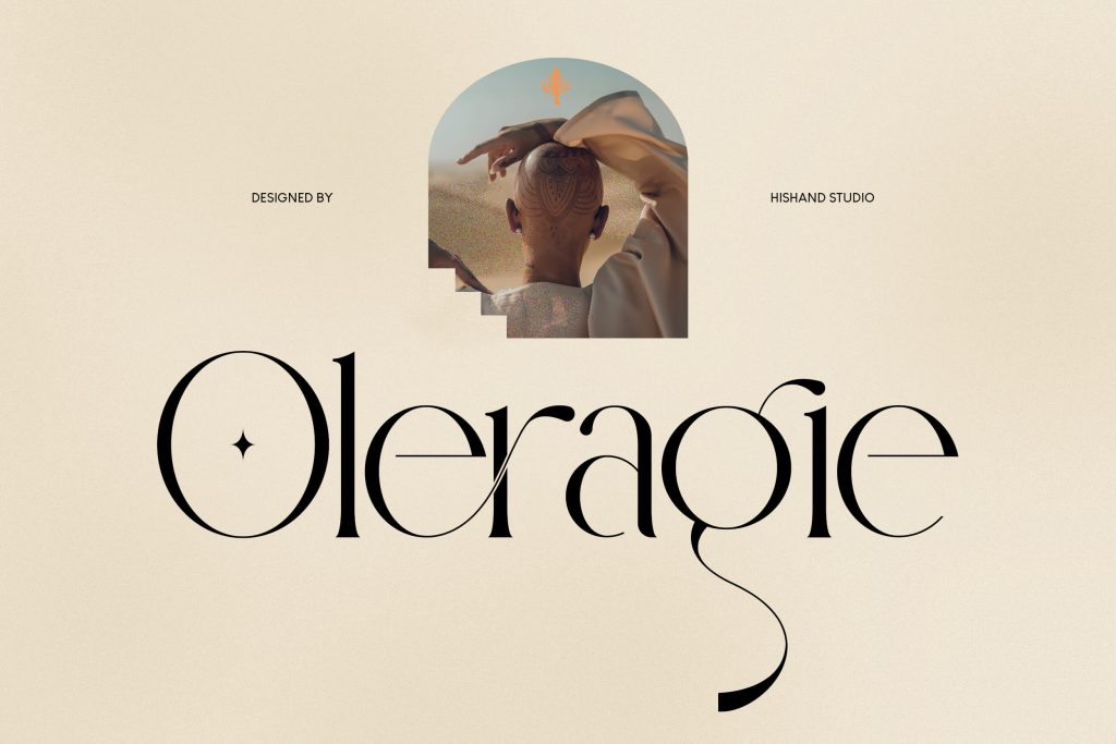
A timeless, grand atmosphere flows from these refined curves and soft contrast. High-end print layouts achieve a classic, prestigious touch with this high contrast font.
8. Dolce Amyara
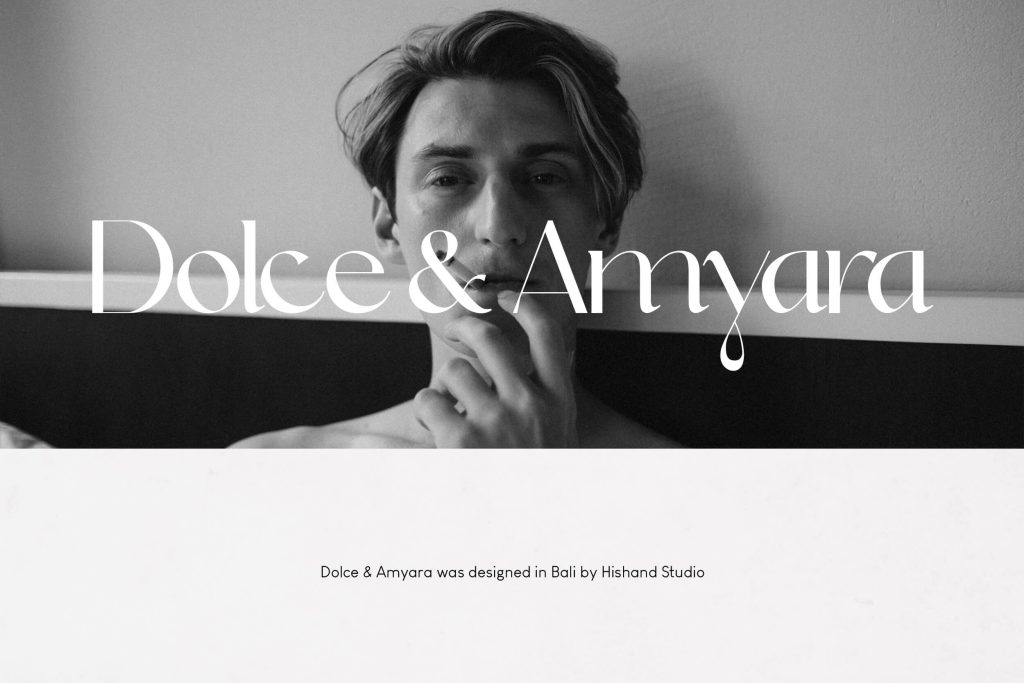
Chic, feminine visuals are enhanced by these stylish forms and clear contrast. Its grace is particularly effective in the beauty and fashion industries.
9. El Molaco
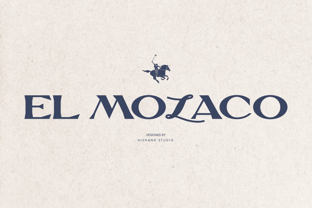
High-impact visual punches are guaranteed with these bold shapes and heavy contrast. It provides maximum visibility for displays that need to grab attention.
10. Monteilga
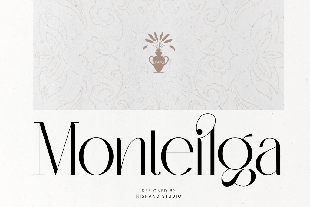
Professional prestige meets fashion editorial tones in this classic serif structure. Magazine covers and high-end branding gain a refined edge through its use.
Also Read: Top 25 Magazine Font Choices That Redefine Modern Editorials
11. Qanoar
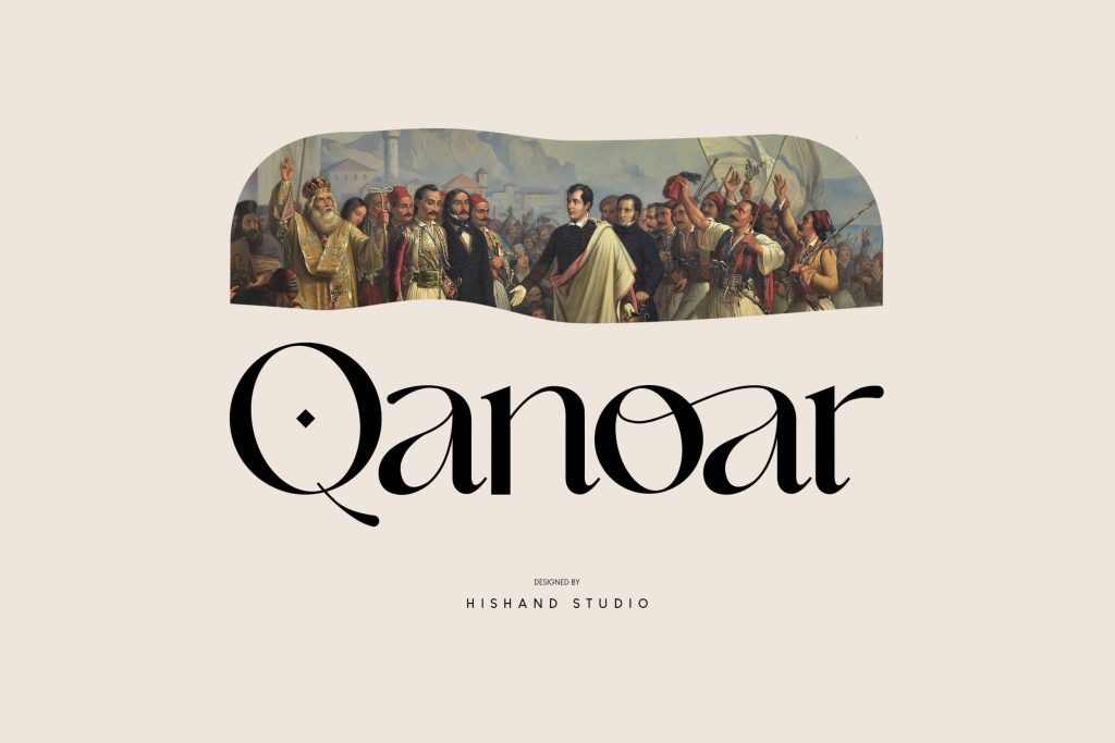
Classy, clean forms define the subtle high contrast of this modern typeface. This high contrast font works effectively for corporate visuals and professional business layouts.
12. La Gagliane
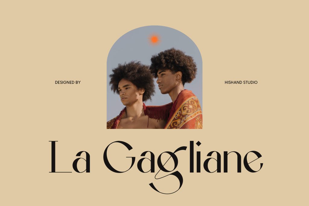
A timeless impression is built through the mix of classic and modern styles. Sharp weight transitions highlight a refined aesthetic perfect for logos.
13. Lamarkie
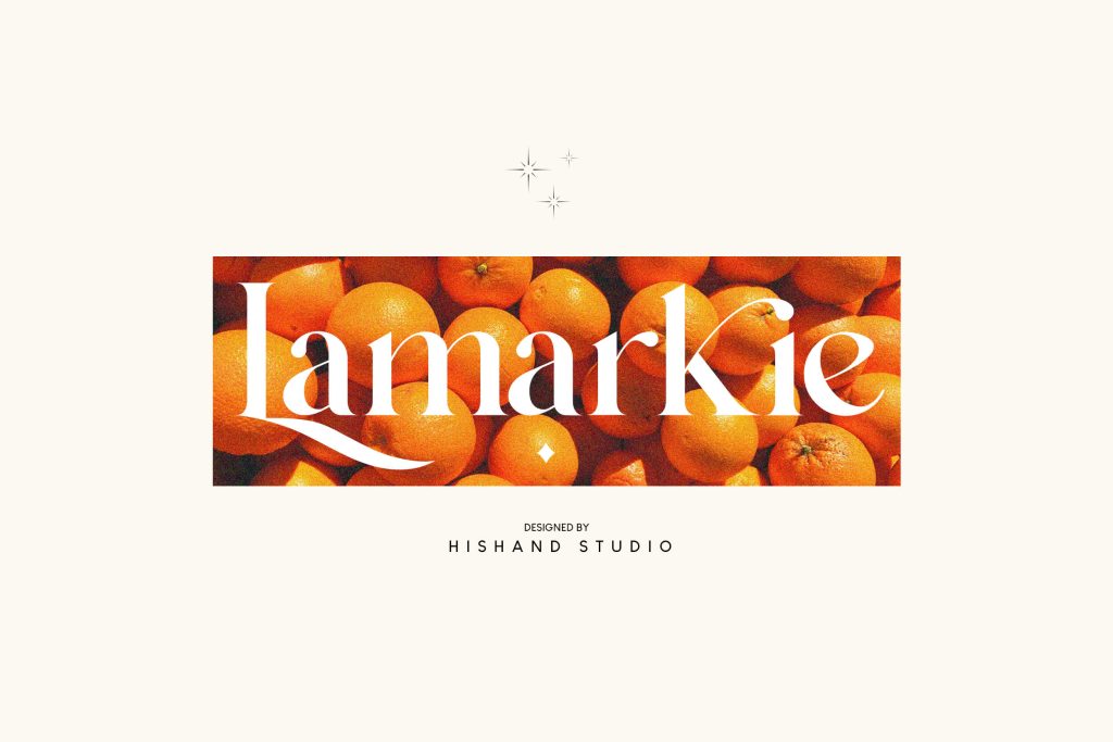
Polished, premium vibes are the hallmark of these elegant strokes. It elevates upscale branding projects with its sophisticated and clear letterforms.
14. Alokary
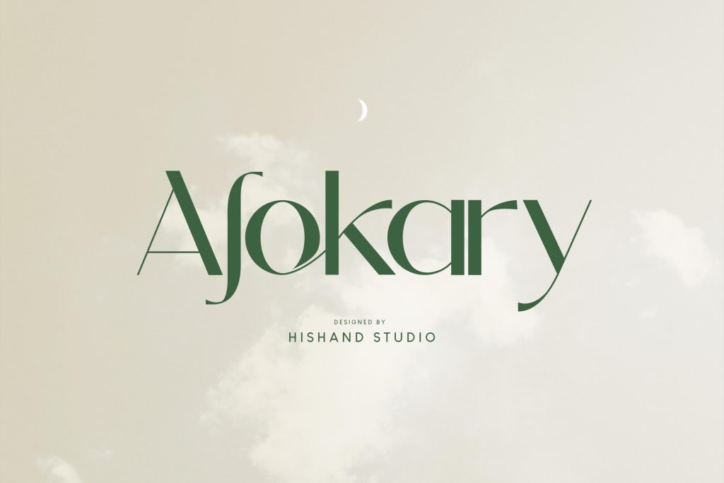
Clarity in modern digital design is achieved through this minimal sans-serif style. Its subtle contrast supports user-friendly and clean interfaces perfectly.
15. Leky Calgria
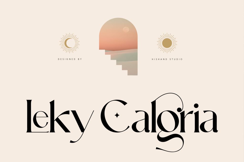
A graceful, poetic tone stems from these elegant details and high contrast. High-end event invitations gain an extra layer of class from this font.
16. Barilod
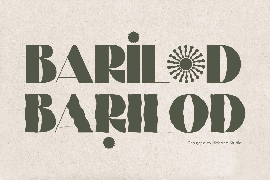
Layouts stay airy and clean thanks to this modern sans-serif’s versatile look. Its subtle contrast offers a professional finish for diverse commercial works.
17. Marde Sauve
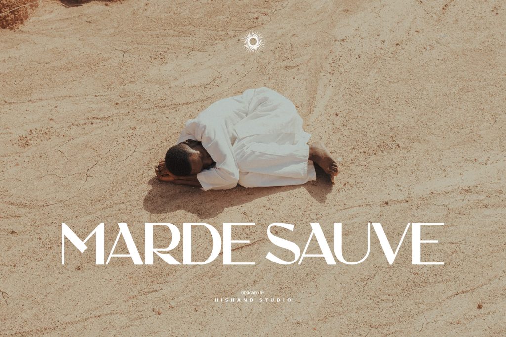
Immediate visual interest is generated by bold display forms and hairline details. Striking creative campaigns find their perfect match in its strong contrast.
18. Buljirya
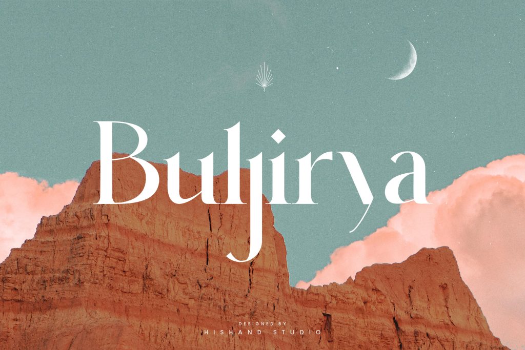
A confident, stylish energy radiates from this modern serif’s sharp contrast. Contemporary brands use this font contrast to build a bold and trendy appearance.
19. Cerkiymo
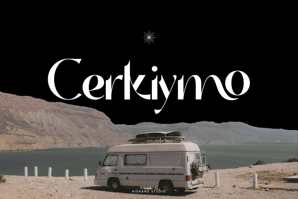
Creative typography projects find a refined finish in this font’s smooth contrast. The artistic flow of its elegant typeface enhances any visual canvas.
Also Read: 20+ Classic Fonts That Never Go Out of Style
20. Raligur
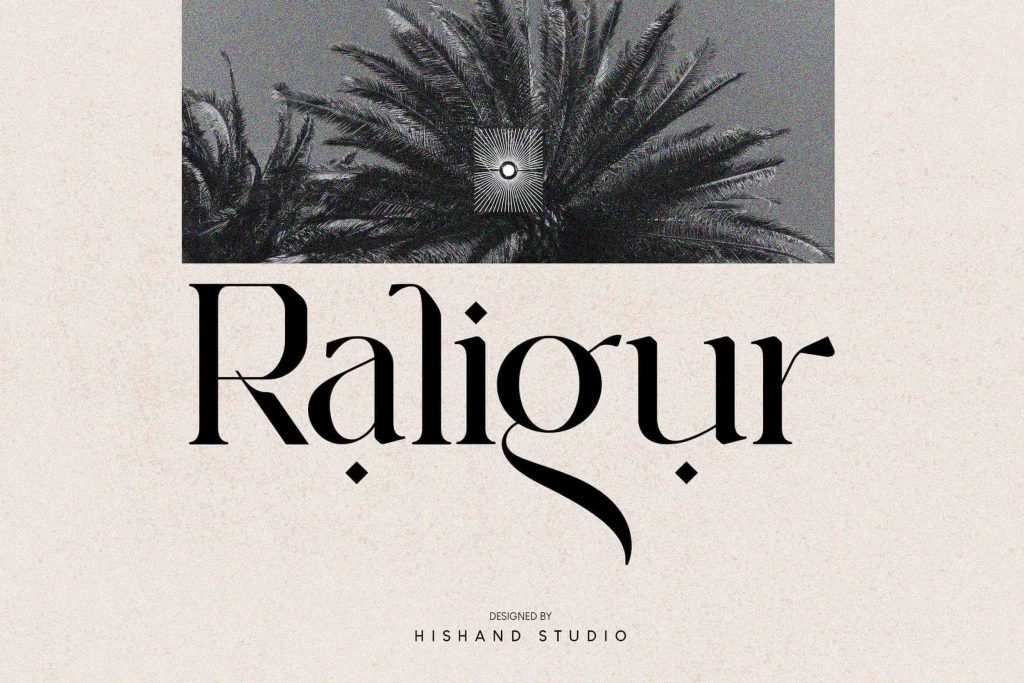
Formal and trustworthy impressions are the core of this classic high-contrast design. It adds a professional, institutional edge to any branding project.
21. Bulgatry
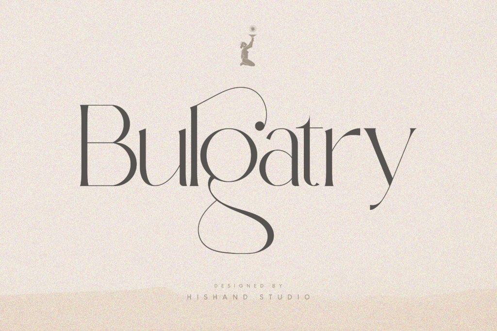
Luxury retail designs shine when using these elegant shapes and sharp contrast. It reflects a polished identity that feels both modern and expensive.
22. Okaluera
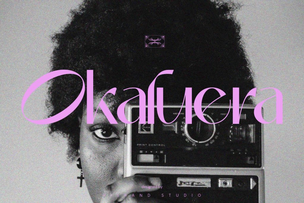
Sophisticated mobile screen presence is ensured by this sharp, high-contrast serif. It produces a clean, modern look specifically optimized for digital use.
23. Celarin
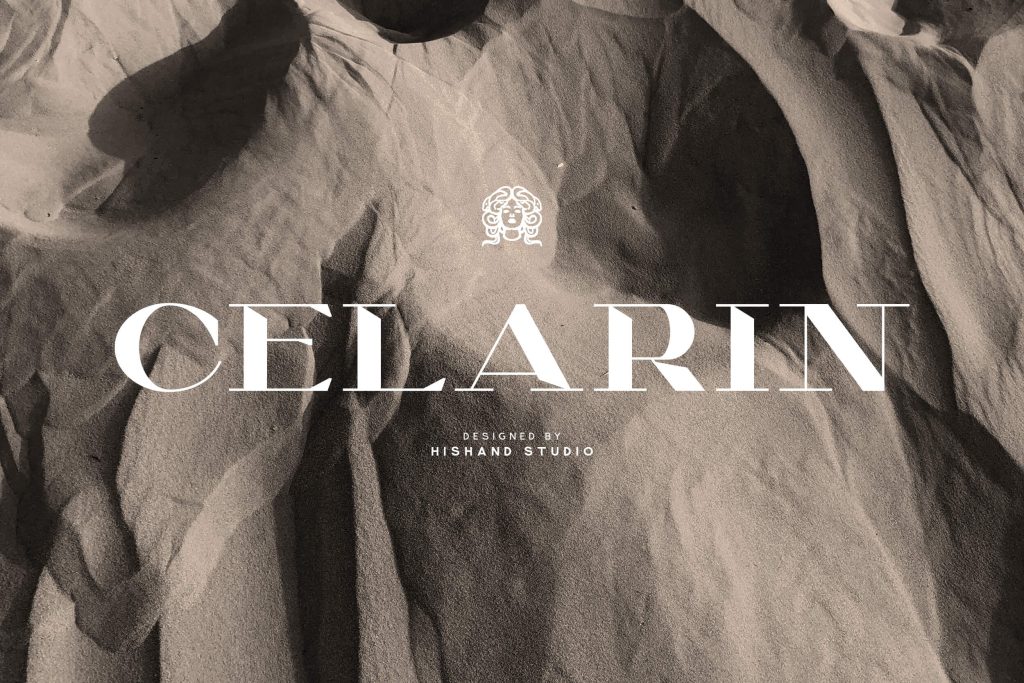
Bold and artistic compositions are supported by the strong contrast of this display font. It excels in unique artworks and creative, non-traditional layouts.
24. Eu Alonira
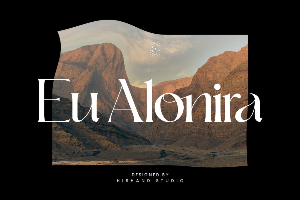
Graceful touches are brought to luxury packaging through these refined serif details. Its sharp contrast delivers a high-end presence that feels truly elite.
25. Conega
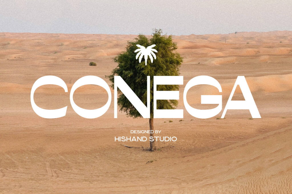
Maximum impact for advertising is driven by these striking forms and heavy contrast. It ensures headlines remain bold and engaging across all creative media.
Also Read: 20+ Fonts for Fashion Brands to Define a Strong High-End Identity
Elevate Your Designs with High-Contrast Fonts Now
In conclusion, choosing the right high contrast font is essential for creating designs that are both visually impactful and deeply sophisticated. The dramatic difference between the thickest and thinnest strokes provides a visual dynamic that standard fonts lack; these typefaces stand as the premier choice for designs that prioritize beauty and class.
For professional fonts with sharp contrast and optimized weight balance, explore the high-contrast typefaces collection at Hishand Studio. We provide fonts specifically crafted for premium branding and high-aesthetic design needs. Get yours today!
FAQs
- What is the main advantage of high-contrast serif fonts?
The thin lines offer sophistication, while the thick strokes provide the structural authority needed for premium branding.
- Are they suitable for long paragraphs?
No. In small body text, the hairline strokes often “disappear,” which reduces readability on most screens.
- How should I pair these fonts?
Pair them with simple, medium-weight sans-serifs to act as the “star” and support details.
- Why are they associated with fashion?
Historically, their sharp and delicate look mirrored the precision of high-end tailoring. This remains the industry standard for elegance and class.