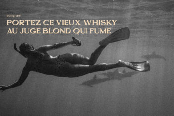
Font Preview
Description
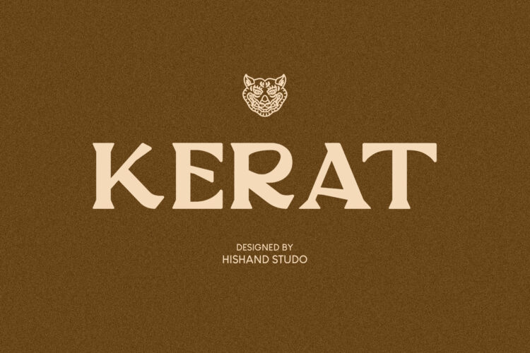
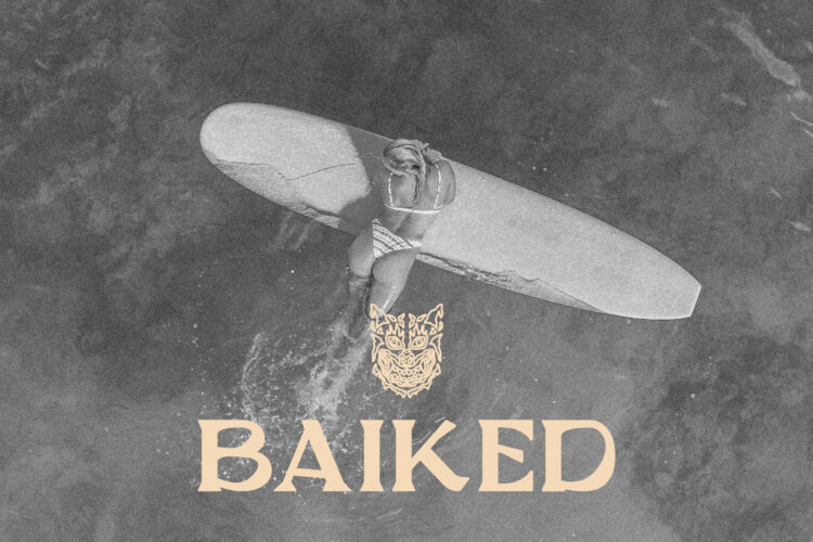
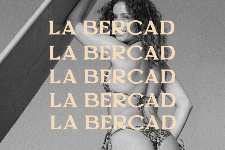
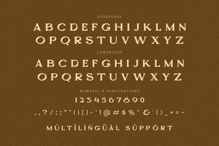
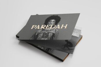
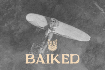
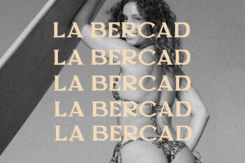
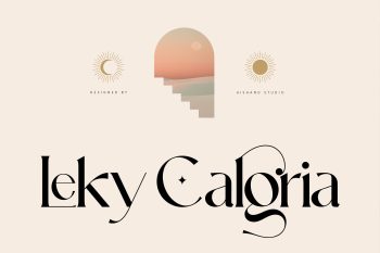
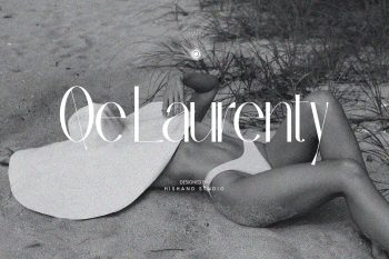
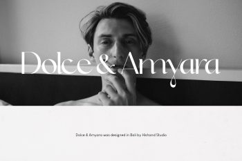
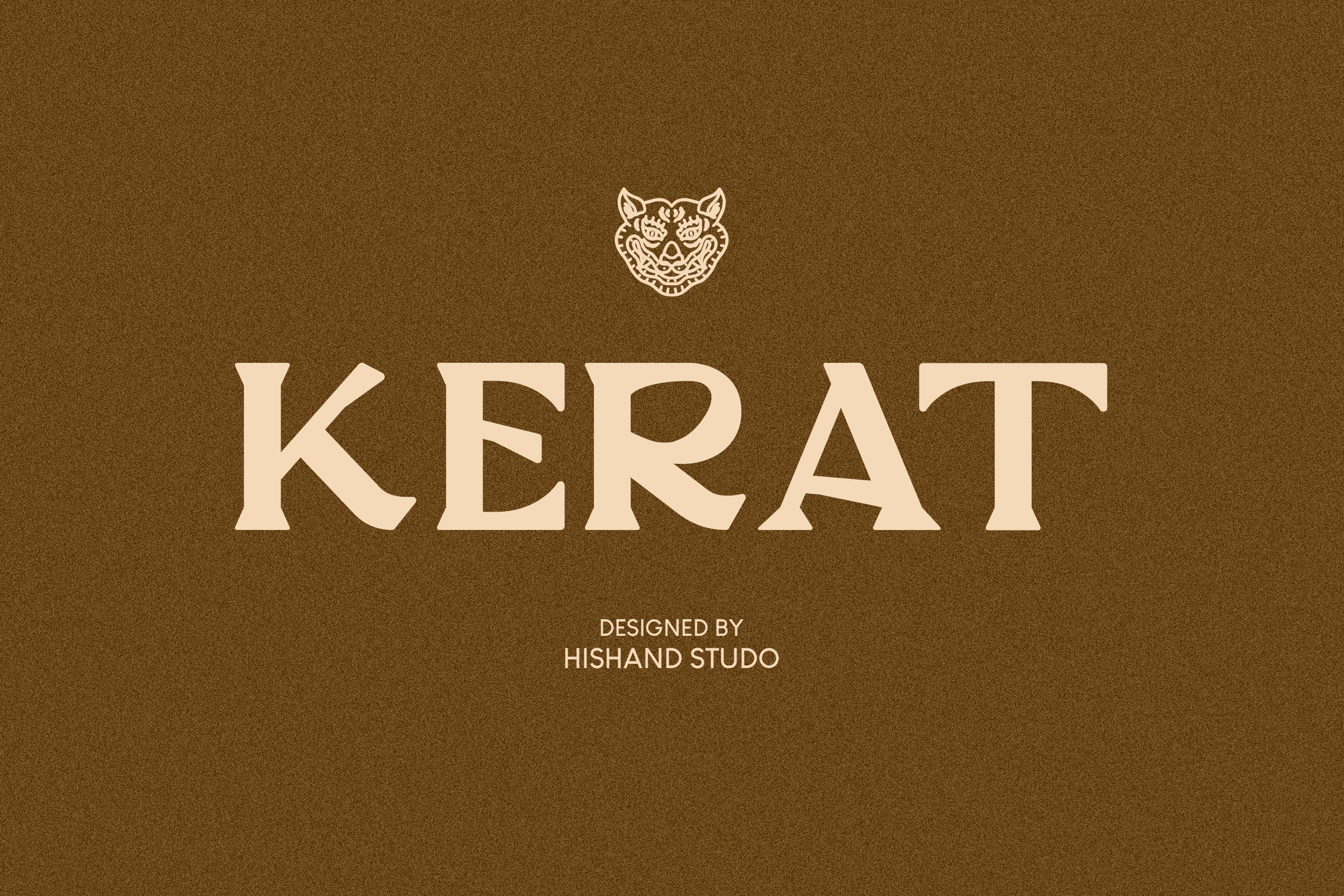
Kerat is a serif display typeface built around the idea that elegance doesn’t need to be cold. Its foundation draws from organic textures and quiet, natural rhythms, the kind of visual calm found in weathered surfaces, plant structures, and unhurried craftsmanship. That sensibility shows up in every letterform. A refined thick to thin contrast gives the typeface presence and sophistication, while slender, gently bracketed serifs keep it warm and approachable rather than rigid or overly geometric. The curves throughout Kerat Serif Font carry subtle modulation, swelling and tapering in a way that feels almost alive, echoing the fluid, imperfect lines found in nature rather than the mechanical precision of a ruler. At the same time, the underlying structure stays disciplined and controlled, so the typeface never loses clarity or confidence, even at large display sizes. This balance of organic warmth paired with editorial polish is what gives Kerat its distinct personality.
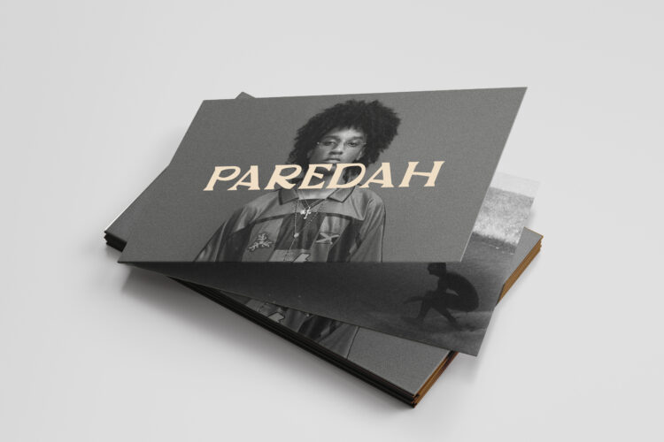
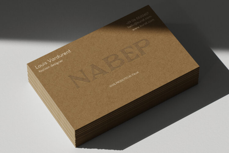
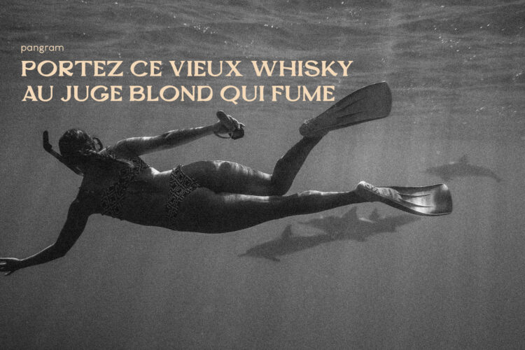
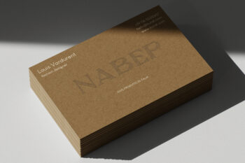
Kerat is designed for brands that want to feel grounded, earthy, and considered. It’s a natural fit for wellness and botanical branding, artisanal spirits and craft beverages, packaging design, premium product labels, and editorial headlines that need a touch of quiet sophistication. It works equally well in minimalist, nature-forward branding and in more vintage-leaning, heritage-inspired design systems, making it a flexible choice across a range of creative directions. Every letter has been shaped with careful attention to detail, from the gentle taper of each serif to the balanced proportions of the counters and the rhythm between strokes. Nothing feels accidental, yet nothing feels overly engineered either. The result is a typeface that reads as handcrafted and intentional, while still holding up to the demands of professional, large-scale use.
Ultimately, Kerat Serif Font offers designers a voice that sits comfortably between vintage warmth and modern restraint. It is textured, grounded, and quietly confident, a typeface built not just to be read, but to be felt, bringing a sense of authenticity and depth to any brand it touches.
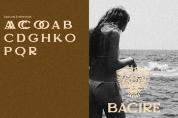
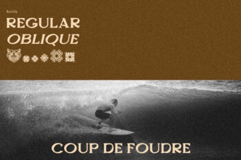
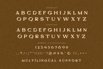
Complete with :
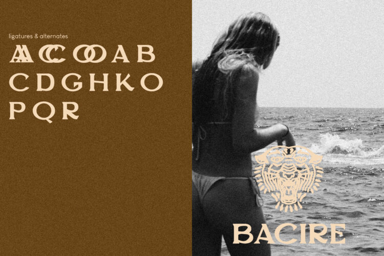
- ligatures
- alternates
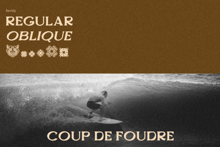
- regular
- oblique
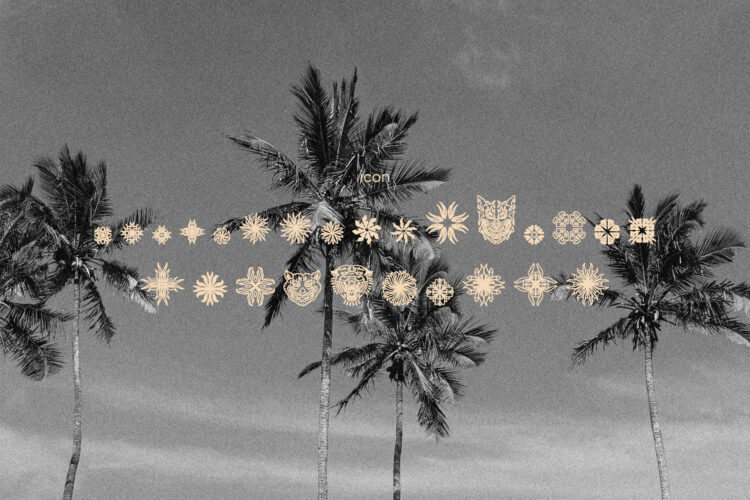
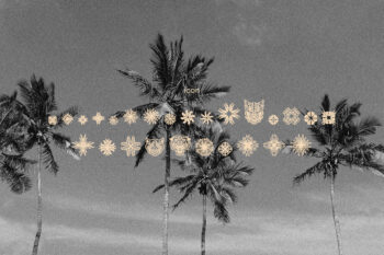
- icon
- kerning
- multilingual support
Additional information
| License Type | Standard License, Web Font License, E-PUB License, Trademark Logo License, App/Game License, Business License, Broadcast/Movie License, Corporate License |
|---|
You must be logged in to post a review.
Reviews
There are no reviews yet.